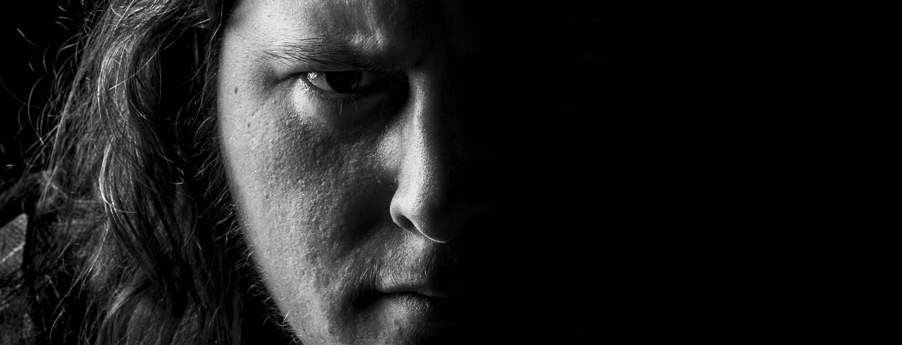
I'm a graphic designer and game developer.
Originally from Sweden, I'm currently located in Adelaide, Australia. I moved here thanks to my wonderful partner and it's been an amazing year here experiencing new things!
I've always been a very creatively driven person. I graduated the Swedish version of High School with a focus on carpentry because I wanted to create things. That evolved into an interest in digital content and games, so I completed my bachelors degree in game design.
Afterwards a few of us started our own game company to build and release a horror game. I had the pleasure of being the creative lead as well as having a lead role in game design.
Recently I've also completed my bachelors in graphic design and enjoy the similarities I've found in both. Here is some of my work.
I'm always eager to learn new things, especially in those areas that scratches the creative part of my brain!
Minimalistic design is something that is a pattern in my projects. While I love detailed imagery and paintings, I believe my strength lies with the "less is more" category in design.
The logo for OneVault was redesigned to include and push the different modules that exist in their health care platform. Each color in the logo represents a module and the minimalistic style of the logo can be easily used in monochromatic colors for each module.
The red cat is a redesign as well as a vectorized logo for the game company KILLMONDAY Games.
During university we had the opportunity to work with a real client for one of the marketing courses. Our client was the town of Bjursås and the main goal was to encourage more people to visit Bjursås not only because of their popular ski-resorts, but also during the summers.
My main role for this project was the copy and I developed the slogan for this campaign, which we later used to brainstorm the overall design of the marketing campaign. They were printed and used by the Bjursås Skicenter.
The slogan "Sikta Högt/Varva Ner" is vaguely translated to "Aim High/Wind Down". It's a play on words that pushes the Bjursås high mountains as well as the lakes, both of which highlights two different extremes in activities: High speed biking and hiking in the mountains and the relaxing fishing in the lakes.
INDIE is a hypothetical magazine that I designed during a university assignment.
I wanted this issue to highlight graphic artists and their work in indie game projects. So the layout is very clean and uses a lot of the spaces to put their art as the focus. The bright colors and sharp clean style was suppose to bring together the retro game style with a modern look throughout the magazine. Each color represents a chapter in the magazine.
This was created during a university assignment where we had to come up with a design for a cook book. My design came from the idea of trying to push the rustic feel of blackboards and apply it to photos, having the photos be the main focus of the layout. The text was put into unique shapes of white chalk in order to have a dynamic layout throughout the book, making each recipe unique.
For our graduation exhibition at university we created a poster design to come up with the theme for the exhibition itself. My design ended up being a playful dynamic design that was a comment on post-humanism and how the phone has become an extension of ones self.
The robot in each poster was turned into a mascot that could have a unique style for each person. For these posters I decided to try and humanize the robot and put it in famous movie related media and scenes. Which was quite the magnet in the exhibition as people stopped and discussed what each poster was trying to replicate!
In an assignment at univeristy we had to create two posters for a hypothetical product campaign with three themes: Art Deco, glamour and crime. One of the posters had to be a portrait and the other one the product itself. I took the photos.
The Art Deco influence came in the form of the pattern of the spaghetti forms on the ground. The glamour is forced through the chosen outfit for the person in the picture. The crime is probably the theme that is the most present in this project. The spaghetti sauce in his hands represent blood as if something terrible has happened.
I've used Cinema 4D to render realistic images. Lately I've started to use Blender for more optimized 3D assets to use in my personal game development project.
VETERAN is a hypothetical online store that sells hunting and fishing gear. I wanted a minimalistic style while trying to bring a bit of the forest into the design.
The main focus of this project was to learn and implement responsive design by starting the design on a mobile phone scale, and then build it up.